
I spearheaded the development of the Shibui Design System, delivering consistency, efficiency, and extendability to an expanding platform.
My Role
Senior Product Designer
Product
Web, iOS, and Android apps
My Contributions
Strategy
Research
Design
Development Strategy
Challenge
CoConstruct provides a software suite for general contractors including project management, financial management and communication.
With a growing customer base and feature set, we could see barriers to the platform scaling.
For customers, the app suffered from inconsistent UI and poor usability
For the business, building the web app was slow and challenging to build because of legacy code.

As a team we saw an opportunity.
Bring to users a streamlined and consistent user experience.
Increase the speed and ease of building the platform for developers and designers.
Researching the Problem
The best way to address that problem and achieve those goals seemed a design system. We saw the leading companies all developing them and the benefits they brought to their systems. But how could we build the case and convince leadership it was worth the investment? I researched our issues more deeply.
I analyzed the support tickets, NPS surveys, cancellations, and interviews noting the ones that relate to usability.
Analyzing cancelation feedback I found that most of the reasons sighted were user experience-related.
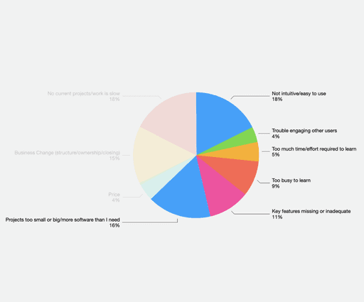

I created an inventory of common components finding many had as many as 10 versions of the same component creating user confusion, duplicating dev work, and miring teams in issues.

Research Insights
Informed by this research, we concluded we had these problems.
Inconsistent UI. Over the years the app became a patchwork of many different styles, layouts, plugins, and technologies. Developers had to build the UI however they could, as fast as they could.
Unpredictable Workflows. Each feature had its own way of doing things, without any consistent workflow patterns. Because of this customers found the system unintuitive, challenging to learn, and time-consuming.
Scattered Code Frameworks. Each feature was coded years apart with new developers using different code frameworks, plugins, and conventions. This caused developers constant confusion, frustration, and time.
Component Library Design
Another designer and I workshopped, pressure tested, and settled on a foundational look and feel based on a recent rebrand: principles, colors, typography, grid system, icons, and styling. That led to designing components, layouts, and pages.


Development Strategy
What components do we build and when? How could we support our existing roadmap of new features and enhancements?
I contributing to a vision where we simultaneously produce new features and build out the design system components. We would build every new feature with new components and over time our library would naturally grow.
I built out a roadmap of all components with upcoming features, the components needed for them, and the build status of each component. This gave the team clarity and kept everyone aligned.
We collaboratively created a clear tooling pipeline that created a streamlined system of production; UI design, development handoff, component approval, and component usage documentation.


Features Built
Within a few months, we had built out new features with new design components creating a significant library of components. The quality of the user experience, as well as the speed of development, was like nothing ever we had created.
Soon after its release, major features were built using the design system including Bills, Custom Branding, and Files.


Impact
Within a few months, we had built out new features with new design components creating a significant library of components. The quality of the user experience, as well as the speed of development, was like nothing ever we had created.
Customer Impact
Visual Consistency. Rather than a patchwork, the system was sleek and modern.
Brand Consistency. Our system looked mature and harmonious with our brand.
Improved Usability. Users could quickly learn multiple features quickly.
Business Impact Impact
Faster Development. Components and patterns are pre-built, reducing guesswork.
Seamless Communication. Designers and developers were using the same components.
Cleaner Code. With standards in place code could be simple and clear.
Build-in Accessibility. All components come complying to accessibility standards.
Supporting Scalability. Additional features can be added without increasing the complexity of the system.
Higher Level Focus. Designers and developers were freed up to focus on higher-level issues and opportunities.

Jason Hilton
Director of Product Design, CoConstruct & Buildertrend
"Nathaniel was a design leader on a small team, and took the lead on impactful user research projects, product enhancements, and our Shibui Design System. His contributions to our product quality were instrumental in positioning CoConstruct for acquisition by Buildertrend. He consistently demonstrates a meticulous approach to UX design, ensuring that every detail is carefully considered. This attention to detail greatly enhanced the quality of our projects and contributed to their success."
© 2024 Nathaniel Sidwell. All rights reserved.